Role of Modernism on Today’s Typography and Design

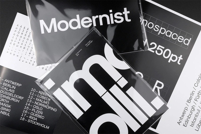
Role of Modernism on Today’s Typography and Design
Role of Modernism on Today’s Typography and Design
To wander through contemporary typography and design without acknowledging Modernism is to skim the surface of visual culture without ever really engaging with its depths. Modernism was not merely a style; it was an epistemological shift that reconfigured how we conceive, execute, and consume visual communication. It persists not as a museum-piece aesthetic, but as a pervasive philosophical substratum beneath the work of designers today.
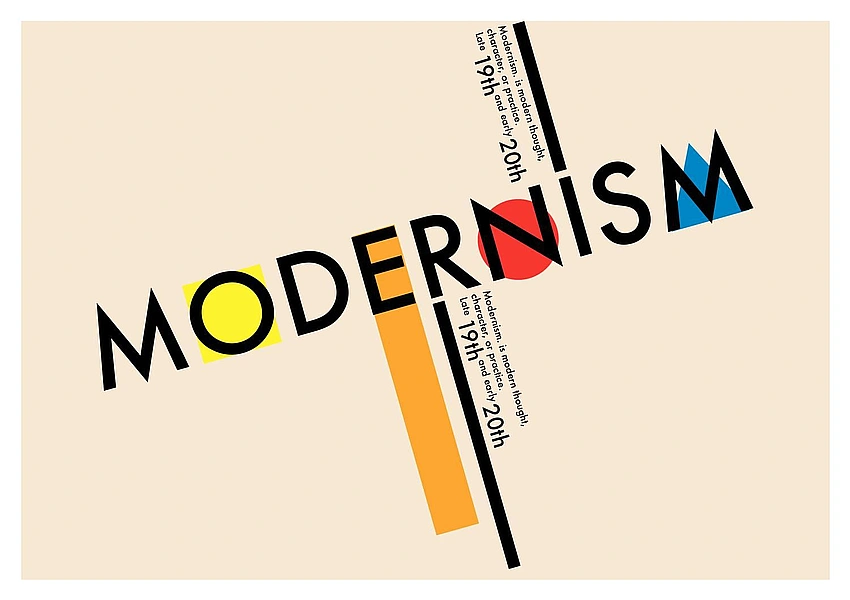
Modernism: A Philosophical and Cultural Milieu
Modernism emerged in the late 19th and early 20th centuries as a broad cultural movement encompassing literature, art, architecture and design. At its core was a break with tradition and a belief in progress, innovation and the rejection of ornamentation deemed superfluous to purpose. In design, Modernism was less a style than a conviction that clarity, function and rationality were paramount.
Crucially, as visual culture theorists remind us, Modernism distanced itself from the historicism and decorative excess of the 19th century. It was not simply an aesthetic preference but a philosophical stance: the belief that human experience, industrial advances and rational systems could be aligned with artistic expression.
Typography: The Writing of Modernity
Typography is where the intellectual ambitions of Modernism became materially legible. In the early twentieth century, figures such as Jan Tschichold championed what came to be called New Typography. Rejecting the ornate lettering of Victorian and Art Nouveau graphic culture, Modernist typographers prioritised sans-serif typefaces, asymmetric layouts, and clear, hierarchical structures. In his manifesto Die neue Typographie (1928), Tschichold demanded that typography be ruled by purpose rather than tradition.
This emphasis on rationality had an almost existential dimension. Rather than being decorative accoutrements, letters were reconceived as functional signifiers whose design should facilitate reading and communication above all else. The so-called “International Typographic Style” (or Swiss Style) that emerged from Bauhaus-inspired principles further codified these ideas, privileging mathematical grid systems, sans-serif fonts like Helvetica, and visual clarity.
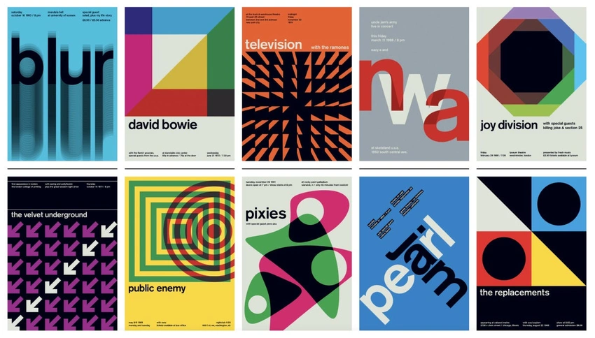
In today’s digital environment, we see that legacy everywhere: responsive grid systems, typographic hierarchies on the web and mobile interfaces, and the continued dominance of neutral typefaces are all descendants of Modernism’s typographic doctrine.
Design Principles: Form, Function and the Grid
The oft-cited mantra form follows function, associated with Modernist design, encapsulates a belief that a design’s appearance should be dictated by its intended purpose rather than ornament or tradition. This principle, while originally applied to architecture and industrial design, was foundational for graphic and typographic practices.
One of the most enduring material legacies of this ethos is the grid system. Modernist designers employed grids not merely as a compositional tool but as a philosophical proposition: rational order as visual ethics. Today’s designers — whether crafting a print layout, a website, or an app interface — still learn and apply grid logic to achieve alignment, proportionality, and readability.
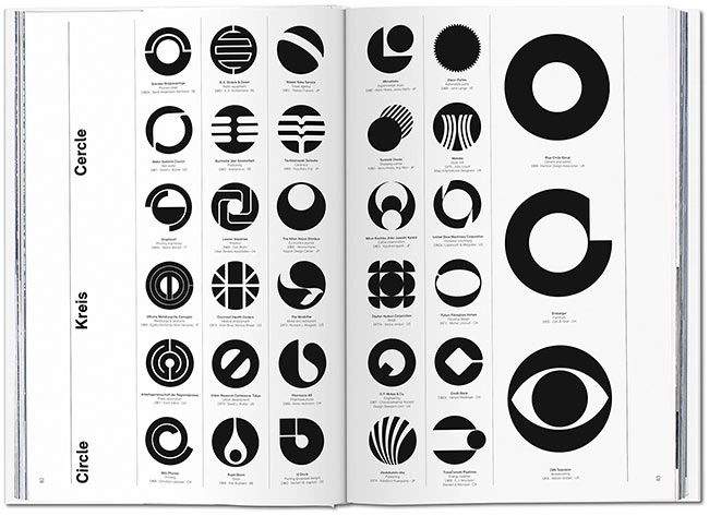
This is not to suggest that contemporary practice is a fossilised relic of early 20th-century thinking. On the contrary, the grid has become a flexible system adaptable to myriad platforms and contexts. But its origin in Modernist rationalism is still discernible in its ubiquity.
Modernism’s Cultural Afterlives and Contemporary Reconfiguration
It is tempting to romanticise Modernism as a universal panacea for good design. Yet its legacy is more complicated. Critics have argued that the neutrality and abstraction prized by Modernists can, in certain contexts, feel sterile or culturally dislocated.
In response, many contemporary designers engage Modernist principles critically, blending them with postmodern and vernacular sensibilities. This has given rise to hybrid forms — for instance, where strict typographic grids coexist with expressive, immersive visual narratives in branding or editorial design. What remains constant, however, is an underlying debt to Modernism’s insistence on clarity of message and structural coherence.
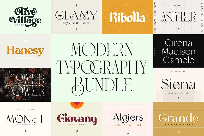
In digital pop culture, this influence manifests in minimalist interface designs, in the sleek legibility of music streaming apps and in corporate identities that favour Helvetica-inspired typefaces and restrained colour palettes. These aesthetics are not merely fashionable; they reflect enduring Modernist logic about how information should be organised and consumed in an age of accelerated media saturation.
A Living Legacy
Modernism’s impact on contemporary typography and design is not an artefact of history but a living inheritance. Its core principles — simplicity, functional clarity, systematic order — continue to be taught, debated, reinterpreted and contested in design discourse and practice. Whether through the grids that shape our screens or the neutral fonts we read every day, Modernist thought quietly structures how we see, read and interact with visual culture.
As a humanities student and pop culture enthusiast, it is exciting to recognise how deeply intertwined these historical imperatives are with contemporary cultural production. Modernism did not merely change the visual language of its own time; it created a grammar that continues to articulate our visual worlds in the twenty-first century.
#Modernism #DesignHistory #Typography #VisualCulture #DesignThinking
