How the Publishing Industry Failed Lolita (Told Through Book Covers)


How the Publishing Industry Failed Lolita (Told Through Book Covers)
How the Publishing Industry Failed Lolita (Told Through Book Covers)
A deep dive into Lolita's decades of cover redesigns shows how publishers shaped readers' expectations by turning a troubling novel into consumer-friendly romance—and Nabokov saw the trend early.
There are few novels whose covers tell a story almost as fascinating as the book itself. Vladimir Nabokov's Lolita has spent seventy years being redesigned, rebranded and repeatedly misunderstood. The irony is difficult to ignore. A novel about manipulation has itself been manipulated by the publishing industry.
Book covers are never neutral. They frame a reader's expectations long before the first page. They are advertisements as much as artistic interpretations, and they often reveal what publishers believe will sell. In the case of Lolita, many covers have transformed a devastating novel about child sexual abuse into something resembling forbidden romance. Looking through decades of editions feels less like studying graphic design and more like tracing the publishing industry's inability, or unwillingness, to resist sensationalism.

Nabokov knew the problem before everyone else
Perhaps the most remarkable part of this history is that Nabokov anticipated it.
When preparing the American edition of Lolita, he sent detailed instructions about the jacket design. He wanted an ordinary landscape after rain, with clear light and open roads. Most importantly, he specified one simple rule: no girls. He understood that placing a young female body on the cover would immediately redirect the reader's gaze towards the very fantasy that the novel seeks to expose.
It is difficult to think of another author who was so explicit about how not to visualise their work. Yet publishers rarely listened.
Selling "Lolita" instead of Dolores Haze
Many of the most recognisable covers feature a teenage girl with heart-shaped sunglasses, bright lipstick, crossed legs or flirtatious expressions. Some editions use photographs of actual young models. Others crop the body to focus on lips, thighs or sunglasses. These images invite precisely the perspective the novel interrogates.
The problem is not simply that these covers are inaccurate. They reproduce Humbert Humbert's gaze.

One of Nabokov's greatest literary achievements is constructing an unreliable narrator who attempts to seduce the reader with elegant prose while justifying horrific abuse. The novel asks readers to recognise how language manipulates morality. Yet many covers abandon that complexity before the book is even opened, replacing psychological violence with visual glamour.
Even the title has suffered. "Lolita" has entered popular vocabulary as shorthand for a sexually precocious young girl, despite the novel presenting Dolores Haze as an exploited child whose identity is repeatedly erased by Humbert. The publishing industry's visual language has arguably contributed to that cultural misunderstanding.
The economics of misunderstanding
It would be comforting to assume these covers were accidents. They were not.
Publishing is a commercial industry, and covers function as marketing tools. A provocative image attracts attention on crowded shelves. During the twentieth century, Lolita carried a reputation as a scandalous novel, and publishers often leaned into that notoriety rather than its literary sophistication. The result was packaging that promised eroticism instead of moral discomfort.
This reflects a wider tendency within publishing to simplify difficult books into recognisable genres. Literary ambiguity is harder to market than romance, crime or desire. A photograph of a mysterious young woman communicates instantly, even if it fundamentally misrepresents the text.
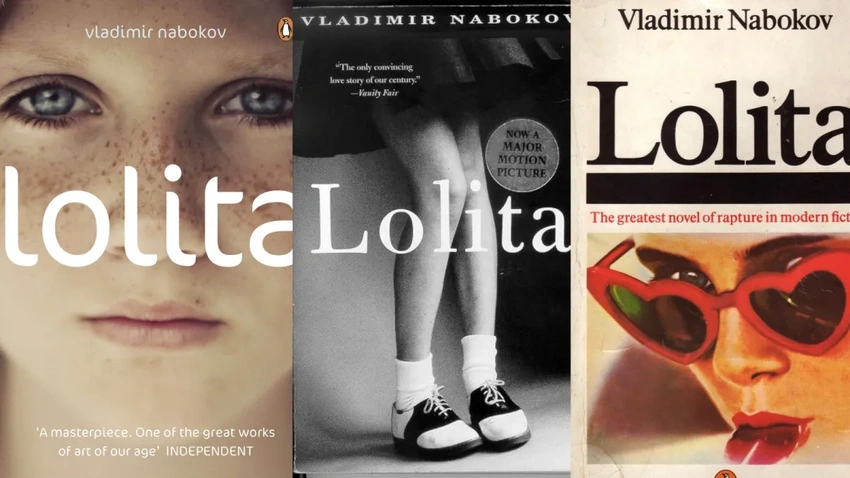
In that sense, these covers reveal less about Nabokov than about the market itself. They expose an industry willing to flatten complexity into a commercially legible image.
When design becomes criticism
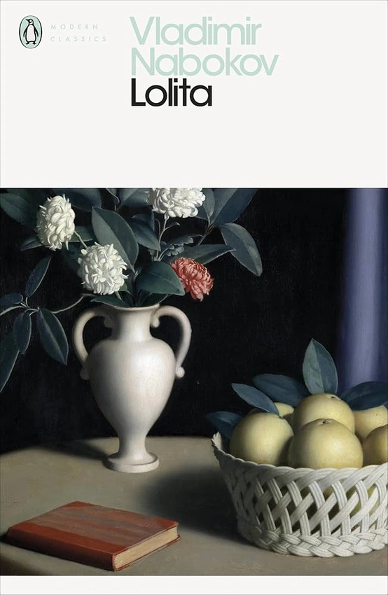
Interestingly, the best Lolita covers are often the ones that refuse to depict Lolita at all.
Several contemporary designers have embraced abstraction. Empty roads, motel signs, butterflies, suburban houses, forests and anonymous American landscapes evoke absence rather than spectacle. These designs acknowledge that Dolores Haze is not an object to be looked at. Instead, they gesture towards memory, loss and psychological unease.
The 2013 design project curated by John Bertram asked dozens of artists to imagine covers that finally responded to Nabokov's original instructions. The project demonstrated that a cover could engage critically with the novel rather than simply advertise controversy.
These designs are compelling because they understand something essential. The most important figure in Lolita is the one we are never allowed to fully know. Humbert dominates the narrative, but Dolores exists beyond his narration, partially obscured, resisting complete possession.
A cover that refuses to display her body may therefore be closer to the ethical demands of the novel than one that reproduces Humbert's fantasy.
Reading the covers as cultural history
Looking across seventy years of Lolita covers reveals changing attitudes towards women, children and desire. Earlier editions often aestheticised youth with little hesitation. More recent editions increasingly avoid sexualised imagery, reflecting broader conversations about consent, exploitation and representation.
The covers become historical documents. They chart how visual culture has negotiated a deeply uncomfortable text and, more often than not, failed to escape the narrator's influence.
Perhaps that is the novel's final trick. Humbert does not only manipulate readers inside the book. He seems to have manipulated publishers outside it as well.
For me, the history of Lolita's covers is ultimately a lesson in visual literacy. A book cover is never just decoration. It is an interpretation, an argument and sometimes a misreading. Few novels demonstrate this more vividly than Lolita, where the image on the front cover can either challenge Humbert's gaze or quietly become complicit in it.
