Why Your Paint Looks Off: Decoding 2700K, 3000K, & 4000K Light

Unlock the power of Kelvin ratings! Learn how 2700K, 3000K, and 4000K light bulbs dramatically change how your paint, wood, and metals appear. Get your lighting right.
Light Matters: How Kelvin Ratings Shape Your Home's Look
Ever wonder why your freshly painted walls look subtly different at night compared to natural daylight? The secret lies in your light bulbs' color temperature, measured in Kelvin (K). It's about the very 'feel' and perception of your space.
Choosing between 2700K, 3000K, and 4000K bulbs can dramatically alter how your carefully selected paint colors, beautiful wood finishes, and sleek metal accents truly appear.
Understanding Kelvin helps you craft the perfect ambiance, ensuring your home's elements look their absolute best, day and night. Let's illuminate the differences.

2700K: The Warm, Inviting Embrace
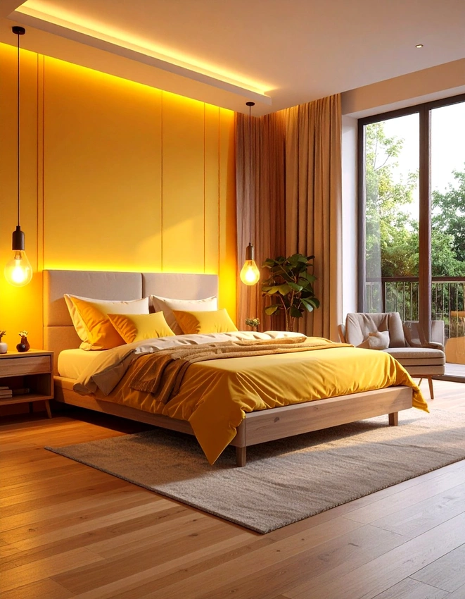
At the lower end of the Kelvin scale, 2700K bulbs emit a 'warm white' light, often described as soft, yellowish, and reminiscent of traditional incandescent bulbs.
Think of a cozy fireplace glow or the comforting light of a sunset.
This color temperature excels at creating a relaxed, intimate, and inviting atmosphere.
It enhances warm tones like reds, oranges, and yellows, making them appear richer and more vibrant. Conversely, cooler colors like blues and greens might look a bit muted or dull under this light. It's the go-to for bedrooms, living rooms, and dining areas where comfort is key.
Many prefer 2700K for traditional or rustic interiors, as it beautifully complements natural wood and warm-toned fabrics.
3000K: The Balanced, Versatile Glow
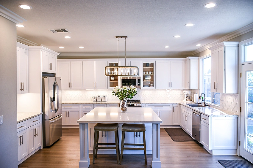
Stepping up to 3000K, we find a 'soft white' that strikes a beautiful balance between warmth and neutrality. It's less yellow than 2700K but still has a welcoming quality, avoiding the starkness of higher temperatures.
This makes 3000K incredibly versatile and a popular choice for many modern homes.
This temperature renders colors more accurately than 2700K, making it suitable for spaces where you need a truer perception of hues, but still desire a comfortable feel. It's excellent for kitchens, bathrooms, hallways, and general living areas. For those who find 2700K too yellow but 4000K too clinical, 3000K is often the perfect compromise.
One interior designer aptly noted, “ 3000K is like your home's perfect white shirt, always appropriate, always stylish. ”
4000K: The Crisp, Energizing Clarity
Moving higher on the Kelvin scale, 4000K emits a 'cool white' light. This light is brighter, crisper, and has a noticeable blue-white tint, similar to bright midday sunlight. It's an invigorating temperature that promotes alertness and visual clarity, making it ideal for task-oriented environments.
4000K makes whites appear whiter and enhances cool tones, giving metals a sharp, contemporary gleam.
However, it can make warm colors seem dull or even washed out.
It's perfect for home offices, utility rooms, garages, or modern minimalist spaces where a clean, bright aesthetic is desired.
If you're trying to accurately see colors for hobbies or tasks, this temperature provides excellent visibility.
It's about efficiency and precision, not necessarily coziness.

Beyond the Bulb: Crafting Your Perfect Ambiance
Choosing the right color temperature isn't just a technical decision; it's an aesthetic one that deeply impacts your home's mood. Consider the function of each room, your existing décor, and your personal preference. For instance, a bedroom might thrive with 2700K for relaxation, while a kitchen could benefit from 3000K for general tasks, and a home office might shine under 4000K for focus.
Don't be afraid to experiment, perhaps even mixing temperatures in different zones within an open-plan space.
The right lighting truly brings your interior design to life.
