Why Your Android Calling Screen Suddenly Looks Different

Why Your Android Calling Screen Suddenly Looks Different
Android users in India get a fresh Google Phone UI with Material 3 Expressive design. See the new Contacts tab that combines recent and favorites, bottom keypad, and a safer horizontal swipe for incoming calls.
You don't need to be concerned if you're an Android user in India and have noticed that your calling screen appears different. This is because the Google Phone app recently updated its user interface. The app now has a new appearance thanks to the addition of Material 3 Expressive elements. Let's check them out!
New Interface Revamps Calling Screen
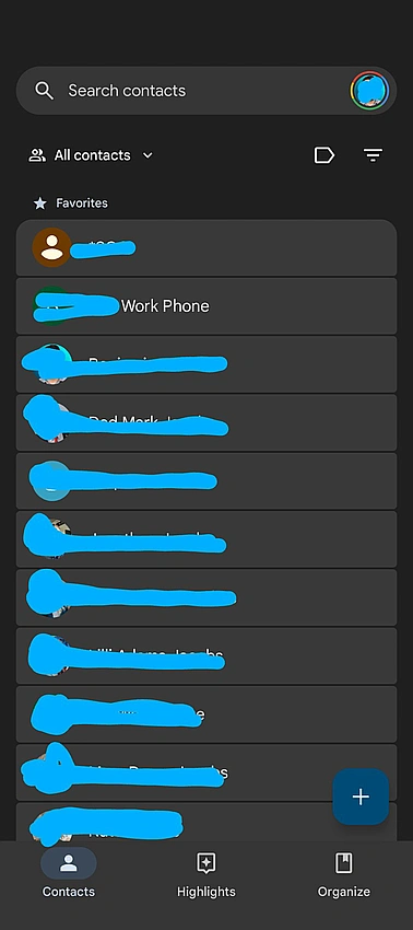
Contacts:
A single tab now contains both your recent and favorite contacts. Favorite contacts appear in a carousel at the top, while recent conversations are placed in a container below. The keypad, which was formerly a floating button, is now located at the bottom on its own tab. You can still access contacts from the three-dot menu, but they have been moved to a new navigation bar at the top.
Incoming Calls:
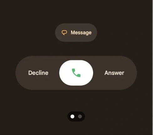
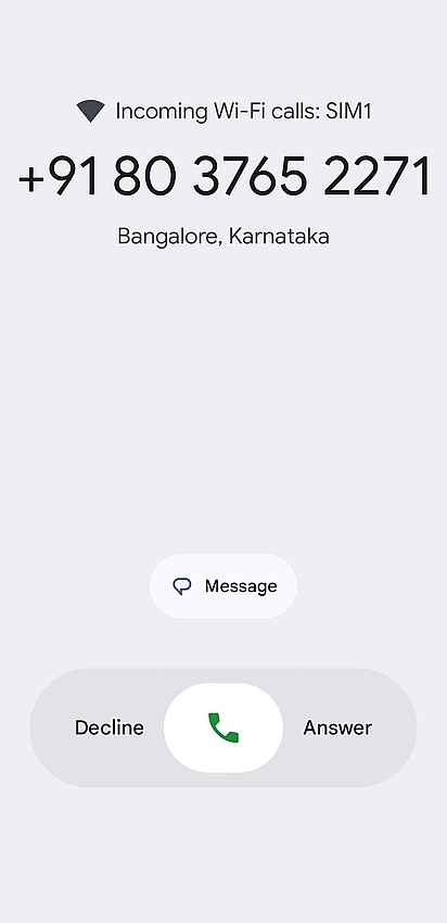
To avoid unintentional actions, the incoming call screen has been updated. You must now swipe horizontally rather than vertically to accept or reject a call. This modification attempts to lessen unintentional call answers or declines that frequently occur when removing your phone from your pocket. If you would like, you can return this setting to a tap.
In-Call Buttons:
The end-call button has been enlarged for improved visibility, and the call screen's buttons now have rounded corners.
Future Update
Although testing is still ongoing, Google is also working on another update that will enable full-screen images to show on the incoming call screen. Beta testers can now use this feature, which is known as the contact card. Google is also redesigning the Android Clock app with Material 3 Expressive in the interim. A taller bottom bar and a new, square floating button in a corner rather than the customary circular one in the middle are two features of the updated app. Additionally, the new design will highlight active alarms with various colors.
#AndroidUpdate, #GooglePhone, #MaterialYou, #UIRefresh, #MobileTech
