The Psychology Behind ‘Dark Mode’

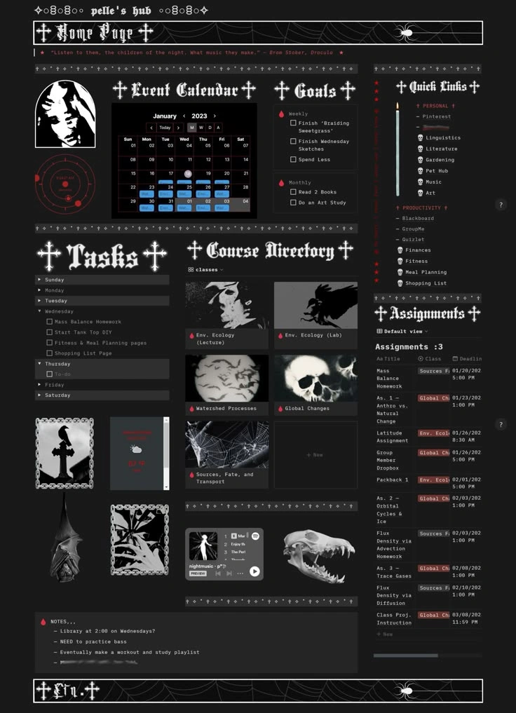
The Psychology Behind ‘Dark Mode’
The Psychology Behind ‘Dark Mode’
Why everyone prefers it — and what it says about modern screen culture.
A decade ago, dark mode was a niche setting buried deep inside developer menus: a whole secret option which only programmers, night owls, and gamers bothered to enable. But today, it’s the default aesthetic of the digital world. Most of us switch to dark mode instinctively, almost emotionally, like drawing the curtains at night.
But the rise of dark mode isn’t just about eye strain or battery life.
It’s about psychology, culture, comfort, and control.
Choosing dark mode has become a subtle, silent language: a digital mood, a personality trait, a coping mechanism, even a cultural shift in how we engage with screens. To understand why almost everyone prefers it now, we need to look far beyond the settings menu.
Our screens are the brightest objects in our lives. White backgrounds, until recently, were the default across everything: websites, PDFs, email, messaging apps. In a world overflowing with visual noise, dark mode feels like a whole other refuge.
Nighttime screen use also makes dark mode feel like an emotional blanket. People associate darkness with:
• quiet
• privacy
• reflection
• relaxation
So when your phone screen turns black, your brain interprets it the same way it interprets a dimly lit room: like a calm, and protected space.
Bright screens feel … kinda intrusive. They demand attention. They glow with urgency. They usually make your device feel like a tiny spotlight shining directly into your eyes.
Dark mode, on the other hand, feels soft. Private.
It lets you disappear into the screen instead of being illuminated by it.
Simply put:
Dark mode gives us a way to exist online without feeling on display.
There’s a reason black has always been associated with elegance: from high fashion to luxury packaging. Dark mode taps into that same cultural symbolism.
Black=modern
Black=sleek
Black=powerful
Black=minimal
Black=high-end
Even tech brands know this. Apple's "Space Gray" products, Tesla's interiors, luxury watches, they all rely on the same subconscious aesthetic logic:
Darkness feels premium.
This aesthetic appeal became a cultural movement.
Dark mode screenshots look cleaner.
Dark UI feels cinematic.
Dark themes feel intentional and aesthetic.
Dark mode has become the uniform of productivity culture.
Programmers swear by it.
Students use it while working late.
Writers open black-background notepads to focus.
Why?
Because dark interfaces mimic environments associated with concentration: movie theaters, editing studios, gaming rooms, and quiet libraries.
Dark mode became the visual identity of the minimalist internet, the idea that the digital world should feel calming, not chaotic.
Bright UIs come from a long corporate tradition. Google Docs, Gmail, early Facebook, old Twitter: everything was bright, transactional, productivity-driven.
Dark mode feels like the anti-corporate choice.
The softer, cooler, more individualistic alternative.
We’re living in a hyper-anxious, hyper-connected era.
Dark mode aligns with that psychological landscape.
This is why journaling apps, meditation apps, and sleep apps often default to dark mode.
Dark mode doesn’t trigger you.
It holds you.
It reflects the growing desire for quietness in a world that doesn’t stop talking.
