Professional Book Formatting Tips for a Polished Manuscript

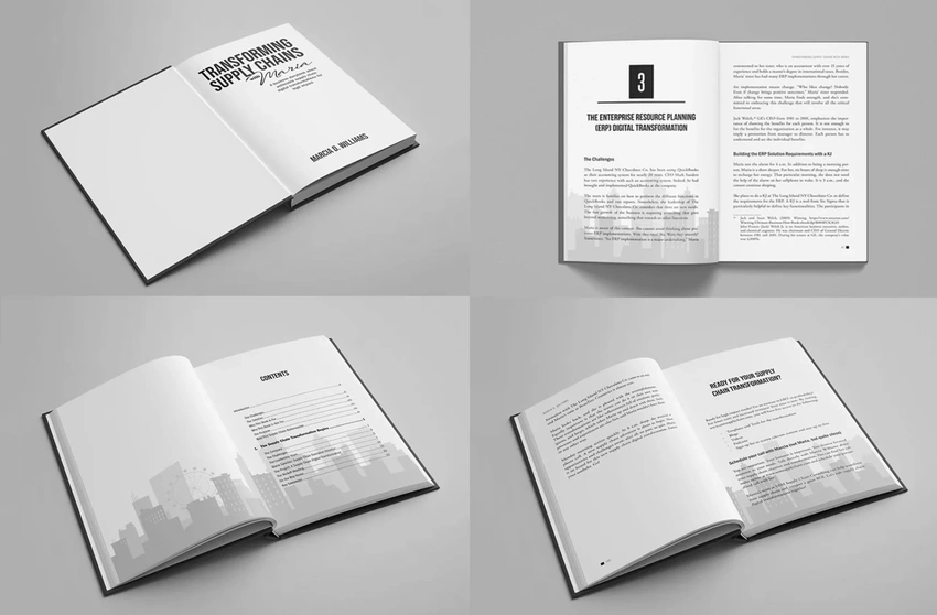
Professional Book Formatting Tips for a Polished Manuscript
Whether you’re self-publishing your first novel or releasing a high-impact nonfiction title, polished formatting transforms your manuscript into a professional product worthy of attention.
Writing a book is a remarkable accomplishment—one that takes dedication, vision, and grit. But even the most powerful message or story can be lost in translation if your manuscript isn’t professionally formatted. Readers might not always notice great formatting, but they’ll definitely notice when it’s missing.
Poor spacing, jarring fonts, misaligned margins, and inconsistent styles can make your book look amateurish, even if the content is stellar. If you’re self-publishing or preparing your manuscript for submission, mastering the fundamentals of book formatting is essential to creating a polished, credible final product.
Whether you're a novelist, memoirist, or professional business book ghostwriter 🔗, formatting is the invisible architecture that shapes the reader’s entire experience. It’s more than aesthetics—it's about clarity, flow, and professionalism. So let’s walk through the most important tips that will take your manuscript from draft to press-ready.
Understand the Difference Between Print and Ebook Formatting
Before diving into margins and font choices, you’ll need to know your publishing format. Print books require fixed layouts with defined trim sizes, while ebooks are reflowable—meaning the content adjusts to fit different screen sizes and devices.
What works for print (like justified text and specific page breaks) can look broken in an ebook. This is why most authors create separate files for each format. If you plan to publish through Amazon KDP, IngramSpark, or similar platforms, follow their exact formatting specifications for each format. Trust us—it’s worth the extra effort.
Choose the Right Trim Size and Page Layout
Trim size (the final size of your book after it's cut) may seem like a technical detail, but it plays a major role in your book’s appearance. Standard sizes include 5” x 8” for novels and 6” x 9” for nonfiction, but this can vary based on genre and audience.
Once you pick your trim size, be sure your document layout matches. Use consistent margins (usually 0.75”–1”) and keep line spacing around 1.15 to 1.5 for readability. Avoid justified text unless you're confident it won’t create awkward spacing—uneven spacing distracts more than it impresses.
Avoid “widows” and “orphans”—those lonely lines that break awkwardly at the top or bottom of a page. These small details greatly affect the professional look of your book.
Font Choice Matters More Than You Think
You may love quirky or decorative fonts, but readability always wins. Stick to professional, easy-on-the-eyes fonts like Garamond, Georgia, Times New Roman, or Minion Pro. These are classics for a reason—they balance style with legibility, especially in long-form content.
Use a consistent font size—typically 11 or 12 pt for the body and slightly larger for chapter titles. Limit yourself to two font styles: one for body text and one for headers. This keeps the design clean and helps readers focus on the content, not the typography.
Use Proper Chapter Structure and Page Breaks
Each chapter should begin on a new page—preferably on a right-hand page if you’re formatting for print. Avoid the amateur mistake of pressing “Enter” repeatedly to push text down the page. Use page breaks instead.
Consistent chapter headings (same font, size, and spacing) help guide the reader and visually signal a new section. Don’t forget to leave breathing space above and below chapter titles to enhance readability and flow.
Also consider inserting scene breaks (like asterisks or extra spacing) when changing locations, timelines, or points of view. They give readers a clear visual pause and prevent confusion.
Don’t Skip the Front and Back Matter
Professional books aren’t just content sandwiched between a cover. There are several essential “bookends” you should include:
Front matter:
- Title page
- Copyright page
- Dedication (optional)
- Table of contents (for nonfiction or ebooks)
Back matter:
- Acknowledgments
- About the author
- Bonus content or ads for your next book
- ISBN, barcode placement, and publisher info
A clean and organized front and back matter shows attention to detail and gives your book a complete, intentional feel.
Formatting Tools Worth Exploring
You don’t need to be a design wizard to format like a pro. These tools make the process easier:
- Reedsy Book Editor: Free, user-friendly, and exports print/ePub files.
- Vellum (Mac only): Polished layouts, ideal for both print and ebook.
- Atticus: A newer, cross-platform tool designed for authors.
- Microsoft Word: Still viable if you know how to use Styles, headers, and page settings properly.
Whichever tool you choose, always export and check your manuscript in PDF or ePub format before publishing.
Proofread Your Formatting Before Publishing
Your final step is one of the most important: proofing your formatted manuscript. Print a physical proof or use the preview tools offered by KDP and other platforms.
Look for:
- Inconsistent spacing
- Misaligned headers or page numbers
- Blank pages in odd places
- Incorrect margin alignments
- Typos were missed in earlier drafts
You only get one chance to make a first impression—don’t let small formatting flaws distract from your hard work.
Conclusion
Formatting isn’t the most glamorous part of writing a book, but it might be the most important one readers never think about. Done right, formatting is invisible. It makes your words effortless to consume and allows your ideas to shine without distraction.
Whether you’re self-publishing your first novel or releasing a high-impact nonfiction title, polished formatting transforms your manuscript into a professional product worthy of attention. Take your time. Use the right tools. And don’t be afraid to consult experts when needed.
Your message deserves to be taken seriously—make sure your formatting says the same.
