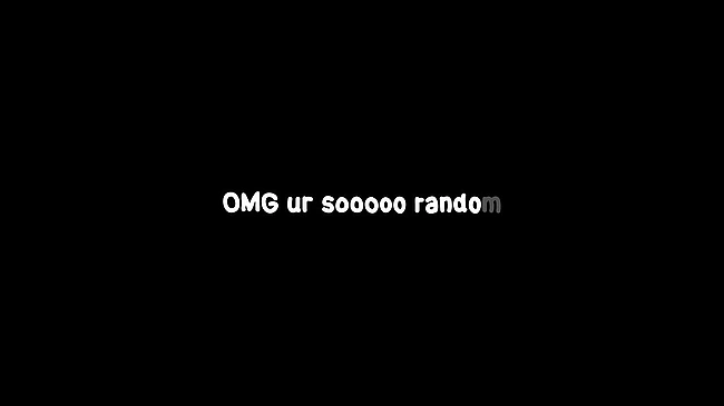
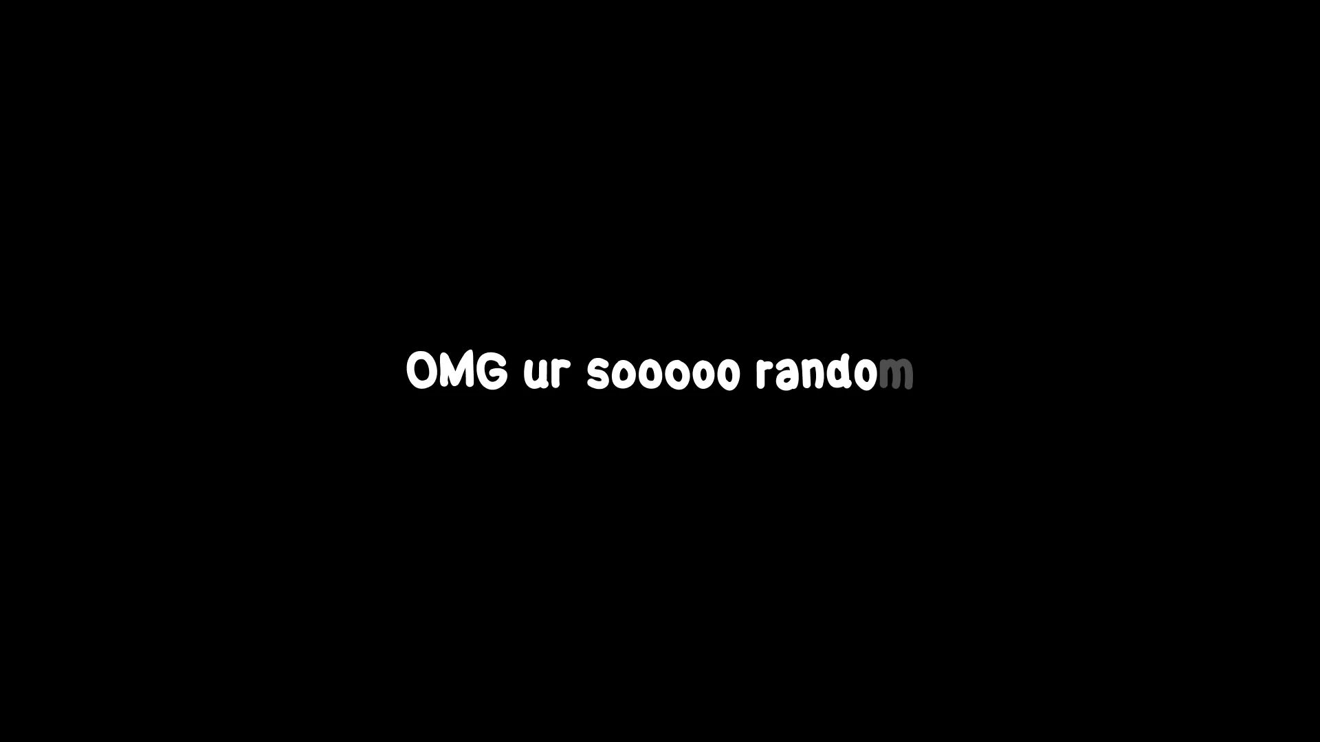
I just saw the most chaotic yet genius font drop ever. It’s called Rando Sans, and honestly, it’s like Comic Sans went to the gym and came back as a total beast. The biggest issue with digital handwriting fonts is that they look fake because every 'e' or 'a' is a perfect clone of the other.
Real writing is messy and inconsistent, and this font actually fixes that. It uses a ridiculous amount of alternates so that no two letters in a row look the same. It’s wild, it’s readable, and it’s probably going to trigger every graphic design minimalist on the planet.
I’m here for the messiness though! We need more personality in our digital spaces instead of these sterile, geometric shapes that feel like they were made by a robot. This is the vibe for the future.
What do we think - is this the future of 'authentic' digital design or just an eyesore that’ll haunt our emails? #design #technology #culture https://thoxt.com/l/od76NX 🔗