I Watched 'Twilight' in High Definition and the Aggressive Blue Filter Is Giving Peak Melancholy
I Watched 'Twilight' in High Definition and the Aggressive Blue Filter Is Giving Peak Melancholy
Revisiting Twilight in HD unearthed a shocking truth: that relentless blue filter wasn't just a vibe, it was a whole mood. Unhinged takes on peak 2000s melancholy and why our screens were so aggressively blue back then.
Okay, besties, gather 'round, because I just rewatched Twilight in glorious, unforgiving high definition, and I need to talk about the blue filter . No, seriously. It's not just a filter, it's an entire personality trait, a cultural timestamp, and frankly, a villain in its own right.
The Blue Awakening
I thought I remembered Twilight . The sparkly vampires, the angsty gazes, the questionable parental decisions, all there. But what I wasn't prepared for was the absolute, unyielding, relentless aggression of the blue.
It's not subtle. It's not a hint.
It's like the filmmakers accidentally left the washing machine on the 'cold wash, extra rinse' setting for the entire movie.
Every. Single. Scene.
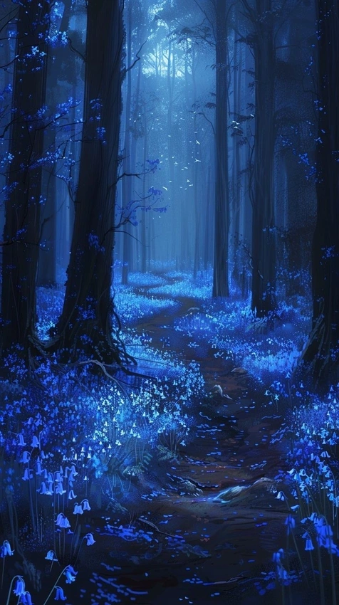
The trees are blue. Bella's pale skin is somehow even bluer. Edward's perpetual brooding?
Amplified by a thousand shades of sapphire.
It's a visual assault that screams, “This is peak 2008 emo, you will feel things!”
Then vs. Now - A Chromatic Chill
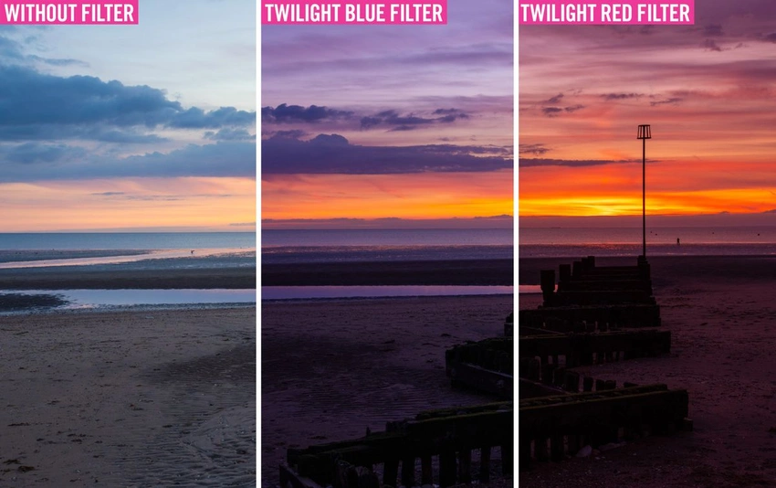
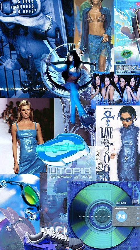
Remember when every early-2000s music video, teen drama, and indie film just had to have that sickly cool tone? We were living in a world of desaturated greens and aggressive blues, convinced it was 'artistic.' Now, we're obsessed with warm, golden hour aesthetics, sun-drenched cottagecore, or the vibrant, hyper-real tones of a Marvel movie. Our screens used to be a cold, hard place.
Twilight is less a movie and more a time capsule of that specific, chilly aesthetic choice.
It makes you wonder, were we all just colder back then?
Or were our eyes simply accustomed to being assaulted by cerulean?
The Melancholy Machine
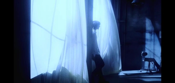
It's about mood. That intense blue filter isn't just accompanying the melancholy, it is the melancholy. It's the visual representation of Bella Swan's inner turmoil, her constant state of mild discomfort and existential dread.
Every time she looks out a window, it's not just grey, it's aggressively blue-grey, signaling that something vaguely sad and vaguely supernatural is about to happen.
One iconic line, “And so the lion fell in love with the lamb,” feels less romantic and more like a dire warning under the oppressive weight of that blue. It strips away any warmth, any comfort, leaving only the stark, almost sterile, reality of Forks, Washington, where the sun apparently died a long, slow, blue death.
A Pop Culture Time Capsule
Watching it now, it's clear this wasn't just a creative choice, it was a defining characteristic of an era. The blue filter of Twilight is as iconic as the soundtrack, the chunky highlights, or the collective obsession with a certain sparkly vampire.
It cemented the film's status as the ultimate moody, atmospheric, teen-vampire romance.
It was the visual language of longing, of forbidden love, and of being constantly, intensely, cold .
Was It All Just a Mood?
So, what does this aggressive blue tell us about ourselves, then and now? Perhaps that we craved a visual representation of the angst boiling under the surface of the late 2000s.
Or maybe, just maybe, it was an accidental masterpiece of mood-setting.
Either way, next time you rewatch, pay attention. That blue filter isn't just background noise, it's a character in its own right, and it's giving peak, unhinged, undeniable melancholy.
