The ‘Color Recession’: Are We Losing Our Love for Bold Hues?
The ‘Color Recession’: Are We Losing Our Love for Bold Hues?
Consumers are increasingly shying away from vibrant colors, fearing mistakes. What's driving this 'color recession' and are we stuck in a world of neutrals?
Look around you, really look. What do you see? A sea of muted tones, isn't it?
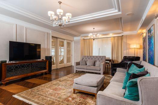
Beige, grey, white, black, they've become the default, almost like a uniform for our homes, our wardrobes, and even our digital spaces. It's not just a passing fad; we're facing what I call a 'color recession,' and it's not about economic downturns, but a profound shift in consumer behavior.
Folks are just too afraid of getting colors 'wrong,' so they opt out of using them altogether. This isn't about personal preference for neutrals, but a widespread anxiety that stifles vibrant expression. But why this fear?
What makes us shy away from the very hues that bring life and personality?
The Pressure to Be ‘Perfect’
In an era dominated by perfectly curated social media feeds, the pressure to get things 'right' is immense. A bold yellow couch might be a statement today, but what if it clashes with the next trending 'aesthetic' tomorrow? It's easier, safer, and seemingly more 'timeless' to stick to a neutral palette that promises versatility and avoids potential visual missteps.
Every purchase, every design choice, feels like a public declaration, subject to immediate online scrutiny.
This perfectionism extends to big-ticket items too. Think about cars or even real estate. Sellers and realtors often advise neutral palettes for interiors, knowing they appeal to the broadest market and ensure higher resale value.
Who wants to buy a house with a shocking pink bathroom when the goal is a quick, profitable sale?
Decision Fatigue and the Appeal of Safety
Our modern lives are packed with decisions, big and small.
From what to eat to what streaming service to subscribe to, our cognitive load is immense.
Picking the 'right' shade of blue for a living room, or coordinating a vibrant outfit, can feel like another overwhelming task.
Neutrals offer a perceived absence of choice that simplifies things. They are the sartorial and domestic equivalent of a 'safe bet,' reducing mental effort and the risk of regret.
Color, on the other hand, is seen as a commitment. A bright orange wall or a patterned rug feels more permanent, more expressive, and therefore, potentially more 'wrong' if our tastes change or if we simply make a poor initial choice. It's about personal expression.
What if my vibrant jacket sends the 'wrong' message about my professionalism or personality?
Breaking the Monochromatic Cycle
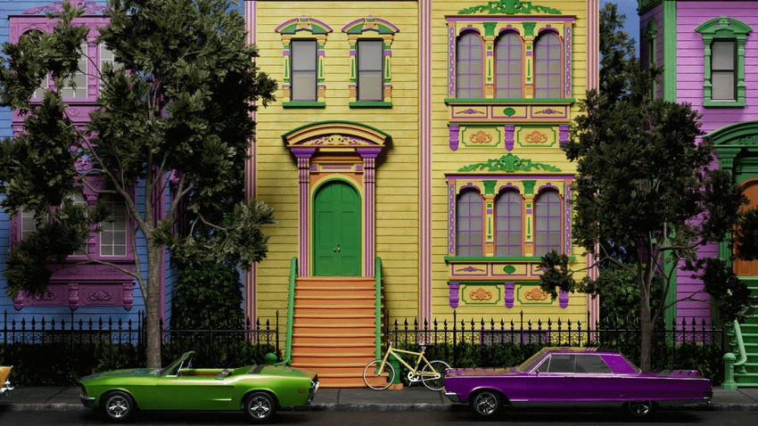
The result of this 'color recession' is a landscape that's visually subdued, often lacking individual flair. While minimalism has its merits, a world devoid of thoughtful, intentional color risks becoming bland, losing some of its inherent joy and personality. Color is a powerful tool for self-expression, for evoking mood, and for making a statement without saying a word.
So, how do we push past this fear?
It starts with experimentation and a shift in perspective.
Think of color not as a potential mistake, but as an opportunity for joy, creativity, and genuine self-expression.
Start small: a brightly colored throw pillow, a statement accessory, a vibrant piece of art, or even a single painted accent wall. Embrace the idea that 'wrong' is often just 'different' or 'unexpected.' There's beauty in the unconventional, and real style often emerges from breaking safe norms.
The ‘color recession’ isn’t permanent if we consciously choose to reignite our passion for the full spectrum of hues. What small splash of color will you add to your world today?
